My surrealistic painting is really personal. So I wouldn't know where to start. While all of these objects look randomly placed and stuck on a pretty background, that assumption wouldn't even come close to the meaning of this. Honestly when starting this unit, my general conception of surrealism was that it was a bunch of controted pictures of real objects. Even though this can be true, doing a surrealistic painting takes on an emotional toll if you paint from the "heart. I mean, Salvador Dali showed how he made a mockery of serious issues or took people, and objects that meant something to him and then transformed them, not randomly, but the way he saw them. My painting has many objects but I'll start with my landscape. THe base, the background of my painting shows pinks, reds, yellows and oranges, to show that, beyond all objects and aspects of life I know that somewhere that I'm still and calm, like the still ocean and sky. But I'm not that simple, and the vibrant colors show that I overcomplicate and color things in, not necessarily in the lines. THe card says 7 of hearts, shows a hand growing out of it; coincidentally the hand has 7 fingers, with a heart on each fingertip. Youmust think that it's a random freaky thing, but no, that week I went through an experience and through it all 7 people stuck my be. And I'd do anything for those 7 people. The hand reaching out shows that I reach out to these 7 people in their times of need, the bloddy fingerprints show that I leave traces of my lessons learned and who I am all over them. The target on my hand shows that there are outsiders who either get jealous or angry, and while they seem very sweet at first (hence, the flower) along the road, (the stem) the can hurt you and aim at you like you're some target (the target and arrow). I used water colors for the ocean and sky to show that even if I can be wild, it's all in good fun and with good intentions. I used acrylic For the fingerprints and the blood I used acrylic because the positive marks that I leave on people are significant and really stand out, in a way they are what you'd say "permanent". The hand is in black and white because with these 7 people, it's completely two absolutes, I either want to help them, or I don't. And it's always the first option because I love all of them. There aren't any in betweens or "what if's". The ballet shoes represent what I did when I was a child, I took ballet, it shows that inside I'm still a three year old, who doesn't always know what to do, and the right answer to say. I used pastels to show a soft effect, because while I can seem that I'm all tough and don't get hurt, I'm not. And the smoothness of the pink shows that I can be a graceful person sometimes. The ribbon shows that I'm so busy trying to help out my 7 people and care for everything and make everything perfect that I sometimes lose myself, which is why the ribbon is hanging losely. I've nearly lost it's grip and I'm barely trying to hang onto the three year old who had everything so easy.
Thursday, December 3, 2009
Monday, October 12, 2009
Musical Instruments & Shading :)

To support our theme of shading and form and
shape we did a still life
of an instrument. In this case, I did a still life
of a trumpet :)
It was very challenging, because it was a shiny object, and there was light reflecting
off of all areas. So it's very important to show strong contrast between a dark
and light area in order to give off the effect to the viewers that the instrument drawn was
shiny and metallic.
I can confidently say that I did not do such a great job in this, because I was so busy trying to
make it look shiny that I forgot about texture. This drawing came out very flat because there is
An important aspect I learnt was that, to make something look like light is reflecting off of it, it's
important to put something ranging from off-white to white next to a dark color, so it stands out
showing the clear difference. I forgot to do that, so this painting lacks the point I was trying to make.
But next time, I know I can do much better :)
Monday, September 28, 2009
Abstract & Conflict :)

We have learned about colors and techniques to transform them into other colors. We applied this
in an abstract painting we did, but to make it different we decided to add
This kind of artwork reminds me of a story. While I was painting this I thought about how stories run smoothly, which is why I represented the smoothness and flow of a storybook through my lines. But then every story, (or every GOOD story) must have a
Tuesday, September 8, 2009
Drawing & Painting Self Assessment

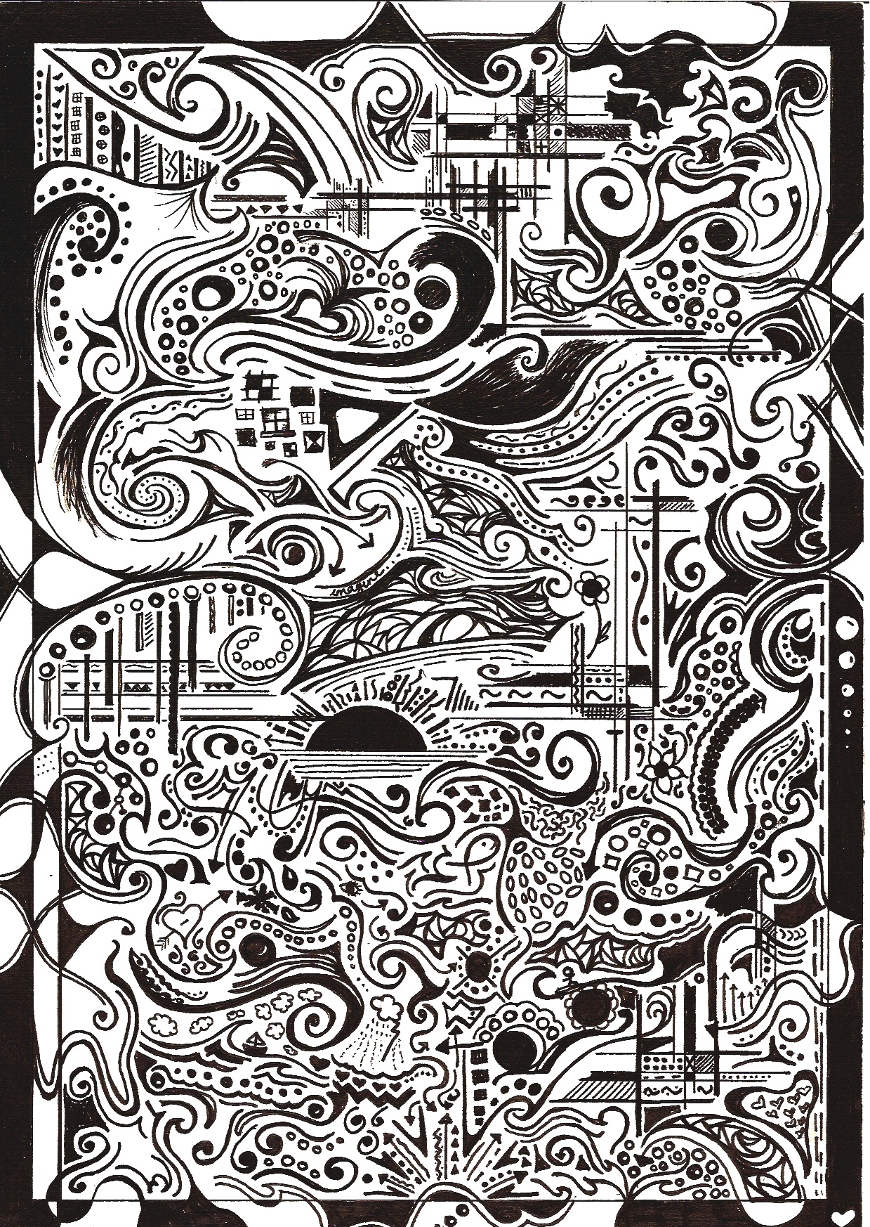
^ my black and white lined painting^
So far in drawing & painting we've been studying value. We just
recently put these skills we've learnt to the test in a Vincent Van Gogh drawing. Although instead of
recreating the painting itself, we did ablack and white version of it, using
markers and lines. Value, is when you add light to a black and white picture, it's shading and also
giving off the impression of it being three-dimensional. So
needless to say, it was really hard to do this project. The process was a challenging one, that stressed me out at
some points. I remember first starting and thinking that it would be near impossible to use marker and
not make mistakes. But along the way I stopped to realize that this
was just like painting, except we weren't using paint. I began to see slowly how I could imagine Van Gogh
himself painting this and which way the lines would have flowed. And whether I'd use short strokes or long
and elegant ones, looking at this project in a different light really made it easier. And this painting was of
irises, and imagining how the lines in an iris would be wasn't as challenging as the project I thought would.
Van Gogh himself also created his original paintings into black and white lines, imagine how hard it'd be for
him not even knowing how the painting would turn out. But Van Gogh was an
artistic genius, who made everyday things look more complicated with his dynamic
lined strokes. He's well known for his paintings of sunflowers, irises, and vast fields, these original
things were turned into masterpieces because Van Gogh decided to show the way the lines flowed in this
situation. If I was given this assignment again I would probably have paid moreattention to
the intricate detail. I am satisfied with the value and the color in my final product, even though the color is
black and white it seems like it would be an easy project. But it's very hard to create value and
add light to the sections that are illuminated. Observation was
key in this project, I observed somewhat, and my observation skills developed even more, because
before all I observed really carefully was those microscopic specimens under a microscope in science ;) it's
amazing how you can connect simple black and white drawings to things like
science. My final results are alright, my other classmates did an amazing
job though, so it's instinct for me to compare mine with theirs :) believe it or not but we didn't just learn
value in this project, life skills and observation skills came with it too.
recently put these skills we've learnt to the test in a Vincent Van Gogh drawing. Although instead of
recreating the painting itself, we did a
markers and lines. Value, is when you add light to a black and white picture, it's shading and also
giving off the impression of it being three-dimensional. So
needless to say, it was really hard to do this project. The process was a challenging one, that stressed me out at
some points. I remember first starting and thinking that it would be near impossible to use marker and
was just like painting, except we weren't using paint. I began to see slowly how I could imagine Van Gogh
himself painting this and which way the lines would have flowed. And whether I'd use short strokes or long
and elegant ones, looking at this project in a different light really made it easier. And this painting was of
irises, and imagining how the lines in an iris would be wasn't as challenging as the project I thought would.
Van Gogh himself also created his original paintings into black and white lines, imagine how hard it'd be for
him not even knowing how the painting would turn out. But Van Gogh was an
artistic genius, who made everyday things look more complicated with his dynamic
lined strokes. He's well known for his paintings of sunflowers, irises, and vast fields, these original
things were turned into masterpieces because Van Gogh decided to show the way the lines flowed in this
situation. If I was given this assignment again I would probably have paid more
the intricate detail. I am satisfied with the value and the color in my final product, even though the color is
black and white it seems like it would be an easy project. But it's very hard to create value and
add light to the sections that are illuminated. Observation was
key in this project, I observed somewhat, and my observation skills developed even more, because
before all I observed really carefully was those microscopic specimens under a microscope in science ;) it's
amazing how you can connect simple black and white drawings to things like
science. My final results are alright, my other classmates did an amazing
job though, so it's instinct for me to compare mine with theirs :) believe it or not but we didn't just learn
value in this project, life skills and observation skills came with it too.
:)

^ this is the origninal drawing Van Gogh created^
Tuesday, August 25, 2009
What have we been doing in Drawing & Painting?
In the drawing and painting course, we have been studying value. Value I learnt, is when you use various kinds of shading techniques to create depth in a simple picture. It also can give idea to where the light in the picture is coming from even if it is in black and white. It gives the whole a picture a three-dimensional effect which makes it seem really cool. Even though shading with pencils is easy, Ms.Bammi taught us how to show value even between different markers. I learnt that by spacing out the lines with thinner markers and fatter markers, we are able to achieve a contrast between the various areas in the picture. To add to this, we recreated a Vincent Van Gough painting using only various sized black markers. We were able to re-think in which directions the lines would go, and how their length would vary. This is what we have been doing so far and art,and it's pretty cool because now I know it's not so hard to add depth into a simple black and white drawing/painting.
:)
Subscribe to:
Posts (Atom)